How to Create Landing Pages
That Convert?
We talk a lot about landing
pages these days, but what exactly are they? Broadly, a landing page is any
page that visitors can get to or “land” on. When we refer to landing pages in a
marketing context, we’re usually talking about standalone pages that are
separate from your main website. We use landing pages to further one, specific
goal – usually conversion, or getting visitors to take a particular action on
the page.
Whether you’re already using
landing pages or not, taking a good look at how you can optimize pages for
conversion is definitely a worthwhile investment. VividBoard, a company
that makes custom whiteboards, committed to improving their landing pages and
saw conversion rates rise from 2% to 27%. That’s huge for their business.
Convinced? Great! Let’s dive
into the ins and outs of creating awesome landing pages that convert like
crazy:
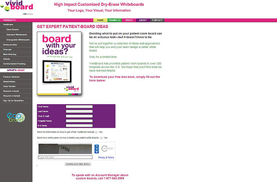
How Vivid Board Increased
Conversions More Than 1,200%
Let’s get back to Vivid Board
and the results they achieved from optimizing their landing page. Before
their 1,250% increase, their “landing page” was really just a standard web
page. It wasn’t designed with one particular objective in mind (it gave
visitors five different options for where to go from there), and that was clear
from the results it produced.
Their original page was
overcrowded and confusing.
So how did they do it? By
designing a new landing page based on four basic tenets:
1. Do one thing really well. When visitors land on your page, they should
have only one option for where to go next. Landing pages are all about lead
generation – gaining email subscribers, trading email addresses for an eBook,
etc. Design your entire landing page to drive visitors into taking this action.

They want visitors’ emails – a large, prominent CTA and brief info form help further this goal.
2. Use visual
elements to create a path for the eye. Once you have one objective in mind,
every element on the page should lead users to your call-to-action (CTA). That
includes visual elements like color, structure, and whitespace. You want
visitors’ eyes to follow a path throughout the page that ultimately leads them
to your CTA.

Our
eyes naturally follow the woman’s… straight to the CTA form.
3. Be reasonable
in your ask. Many
people make the mistake of trying to collect more information than visitors are
willing to give. Most people won’t give out ten different pieces of information
just to download your eBook, and you don’t really need them to. Ultimately, if
you can get their name and email address, that’s a successful landing page.
4. Don’t make it
about you. Your
landing page should focus on the value customers will get from downloading your
eBook, subscribing to your newsletter, etc. Pages that focus too much on your
company or product itself will have a much harder time communicating value.
They won’t successfully convert many leads.
.Ultimately, these four simple concepts led to
the tremendous increase that Vivid
Board saw in conversion rate.

Here’s the page after it was
optimized.
Anatomy of a Great Landing
Page
What to Include (And What to
Leave Out)
Now that we have some
overarching principles to guide us, let’s get down to the nitty gritty. What
elements should your landing page include? Generally, you want to include these
six key things:
- A headline and sub-headlines
- A quick description of what you’re
offering
- One or more images or videos
- Testimonials, customer logos, or security
badges
- A brief information form
- CTA button
Those are all pretty
straightforward, but is there anything you should definitely leave out when
designing a landing page?
It’s usually best to drop the
navigation links you’d typically have on your main site. This helps keep
visitors focused on the one action you want them to take.
Other things to exclude from
your landing page include unnecessary text, extra CTAs, and anything that
doesn’t promote the primary goal.
Remember to keep it simple
and focus on doing one thing and doing it well.
Best Practices
Creating a landing page from
scratch can seem a little overwhelming, but there are plenty of common themes
that can guide you along the way. Here are the key best practices that will
lead to the most effective landing page:
- If visitors clicked on an ad to get to
your landing page, make sure your primary headline matches the ad copy
that led users there.
- Your CTA should be large, contrasting, and
compelling. Place it above the fold so visitors don’t have to go searching
for it.
- If you use images of people or symbols
like lines and arrows, make sure they direct viewers’ eyes to your CTA.
- Focus on one primary goal – everything on
the page should be aligned with this concept.
- Be as concise as possible while getting
your message across – omit anything unnecessary including images, text,
color, etc.
- Infuse the page with your customers’
voices – use real testimonials to foster authenticity.
- Simplify and break up your copy with
bullet points and headlines.
- Include a phone number to increase trust
and add a personal touch.
- A/B test different versions to see how
small changes can affect conversions and click-through rate (CTR).
Successful Landing Pages
Now that we have a good idea
of how to start creating a landing page, let’s take a look at some of these
concepts in action. What does a successful landing page actually look like?
Here are a few examples:
Simple, to-the-point, with a
compelling headline:

Customer-focused value
proposition answers “What’s in it for me?”

Visuals
and concise contact form keep users focused on the objective:

A simple, whimsical image
conveys the value in their offering:

Compelling headline and
concise description of products:

How to Do It Yourself
You’re super inspired and
ready to start creating your own successful landing page now, right? Perfect.
Let’s move on to how you can get these results without an expensive team of
designers, developers, and marketing experts. These tools can help you create
awesome landing pages without the stress or expense:
- Design the page: Lander App & Wix
- Write concise, impactful copy: Hemingway App
- Find and design powerful images: Pixabay & Canva
- A/B testing and analytics: Optimizely and Kissmetrics
If you don’t want to take on
the whole project yourself, you can hire a freelancer to write copy, design the
page, or develop it.
Measuring Your Results
We’ve mentioned measuring the
results of your landing pages a few times now, but how do you actually know if
your pages are successful? What metrics should you be paying attention to, and
what do they really mean? The following metrics will help you determine the
effectiveness of your landing pages, as well as what you can alter to improve
performance.
- Conversion Rate – Conversion refers to visitors
taking the action you want them to, whether that’s making a purchase,
subscribing to your newsletter, etc. This is the most important metric for
landing pages because it’s telling of how successful your page is at furthering
the goal it’s designed for.
- Form Abandonment Rate – Are people starting to fill out
your CTA form, then leaving before they finish? This is important to track
because it can help you determine if your info form is too long and how
much information visitors are willing to exchange for your offering.
- Bounce Rate – How many people who land on your page navigate away from your site without viewing any more pages? With landing pages, this is relative. Many good landing pages have bounce rates up to 70-90% (because they don’t include navigation links). The goal is to ensure your page is relevant to those who land there. Just because a visitor converted, doesn’t mean you’re ready to let them go. A good method to get these leads to stay on your site is to load a secondary CTA once they click the first one. Something like “Thanks for signing up for your free trial. Check out this blog post to learn how to get the most from our product,” will keep converted leads from disappearing.
- Time on Page – How long does the average visitor
spend on your landing page? This can be useful to relate to conversion.
You can determine how likely someone is to convert based on how long they
spend on the page.
- Traffic Source – How do people end up on your page?
Are they finding you in Google results, Facebook ads, typing in your URL
directly? Tracking the traffic source can help with all kinds of
optimization. For example, if you’re spending money to promote your page
on Facebook, but the majority of traffic is coming from Google, you can
more intelligently allocate that budget. Seeing which traffic leads to the
highest conversions can be done in Kiss metrics.
Another key way to test your
landing pages is through A/B testing – creating two versions of a page with one
key difference and testing both versions to determine which is more effective.
The above metrics can help you see what needs changing, but A/B testing will
determine how to change it. Your conversion rate isn’t as high
as you want, but how can you fix it? By doing A/B split tests, you’ll see
whether a larger CTA or shorter info form (or both) will boost conversions.
At the end
You’re Ready
If you’ve gotten this far, you’re probably on board with
creating and optimizing landing pages to boost your online marketing. Once your
pages are live, the key is to track metrics and listen to them. Continually
improving your landing pages will ensure they’re as effective as possible.
So what’s next? Dive into these next steps and you’ll be
well on your way to creating awesome landing pages that convert like it’s their
job (which it is).
1. Decide what goal(s) you want to create a landing page for.
What information do you want to capture from leads? What will your offering be?
2. Determine who your target audience is. Note key demographics
like age, profession, etc.
3. Dig into designing your first page. It doesn’t have to be
perfect. Craft the best page you can – using the info and best practices above
– and you can always improve based on what the analytics are telling you.
Share the article for good people and put your comment to
we know what are you like? Catch up with her on Twitter@sayedraashed.